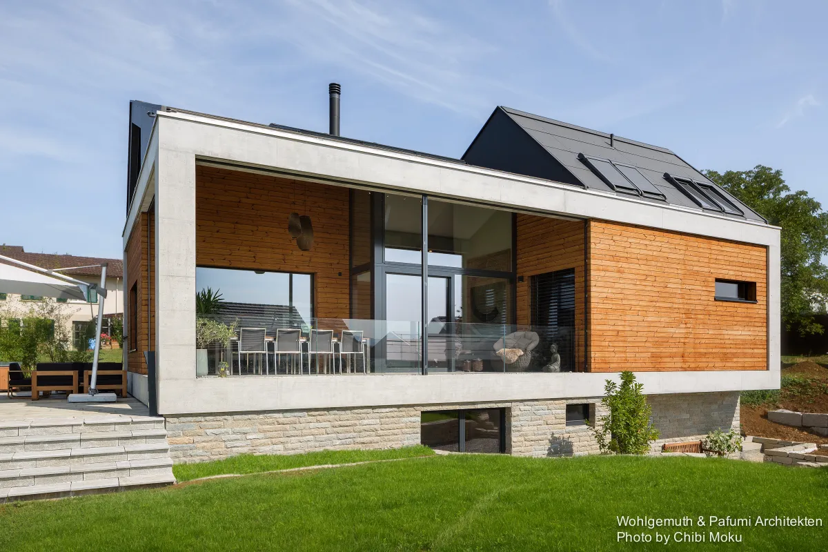
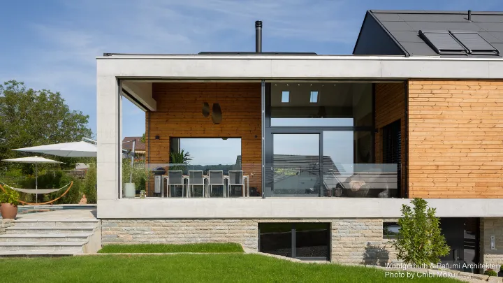
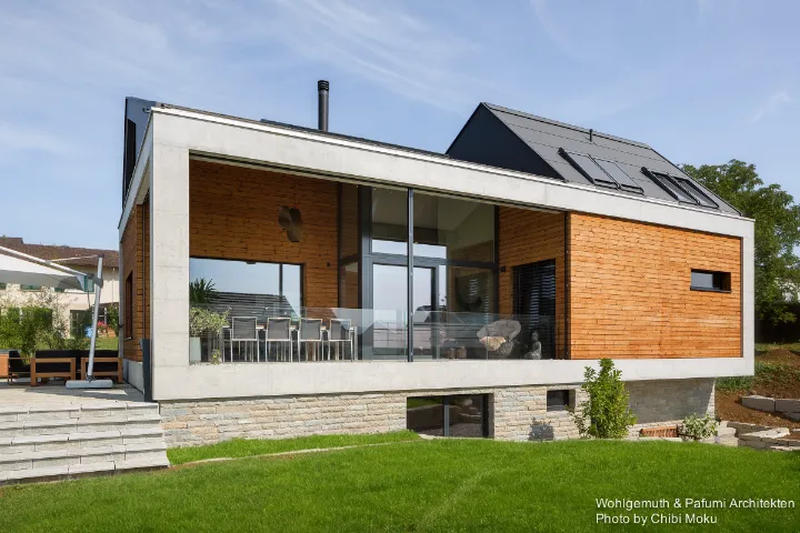
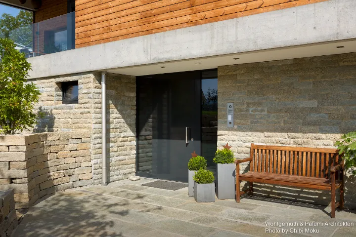
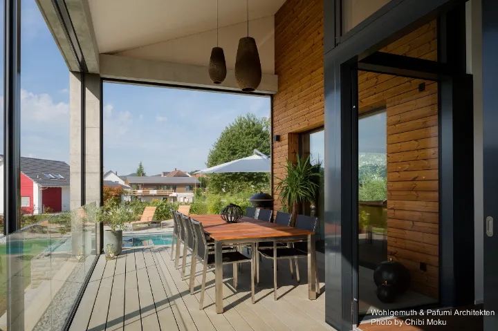
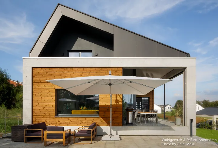
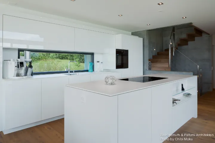
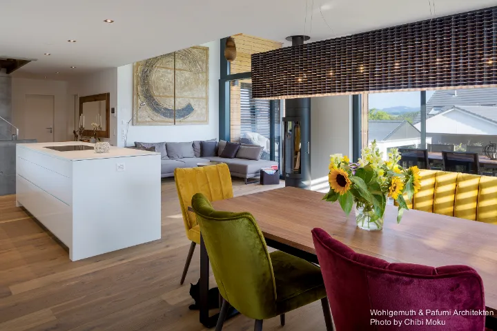
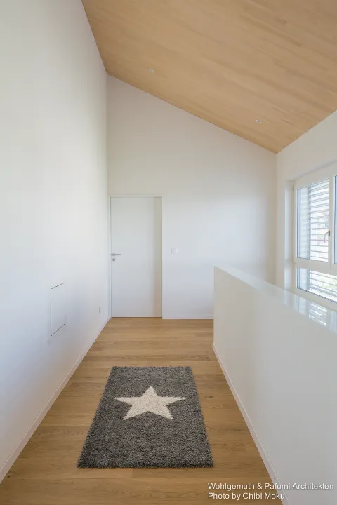
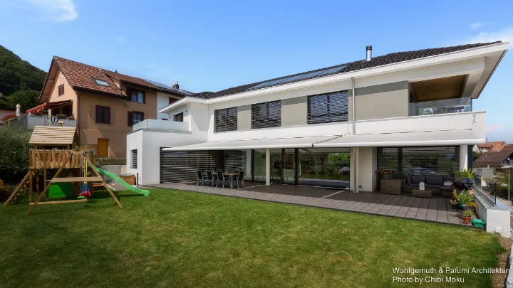
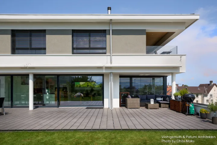
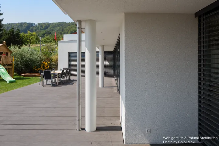
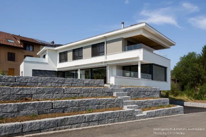
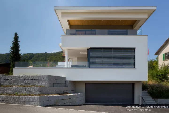
Swiss Simplicity is a contemporary family home in Seltisberg that quietly demonstrates how modern Swiss residential design can feel warm, personal, and lived-in without losing discipline. Designed by Wohlgemuth & Pafumi Architekten (WPArch), the house leans into a restrained palette, concrete, wood, stone, steel, and glass, but uses those materials less as decoration and more as a structural language. The resulting architecture reads as a simple volume from the outside, yet it is carefully “opened” only where views and sunlight matter most, creating a calm balance between privacy and openness.
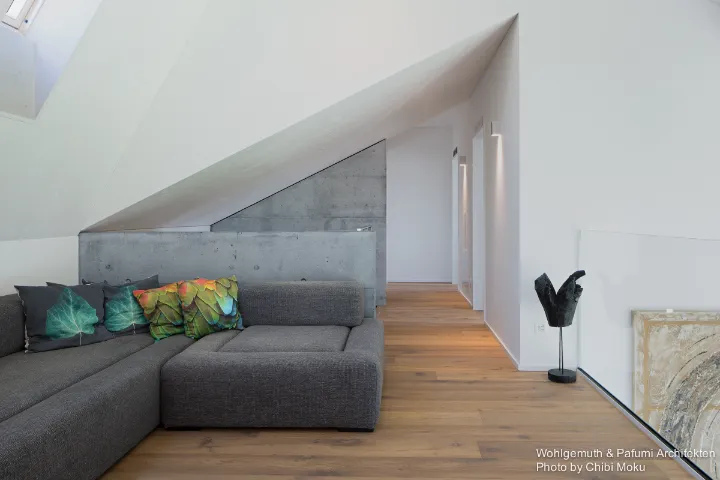
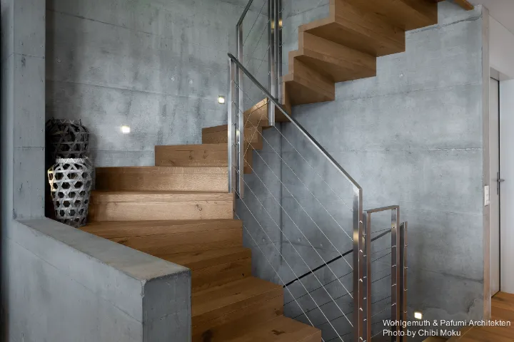
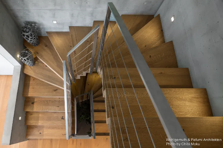
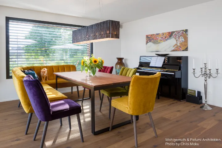
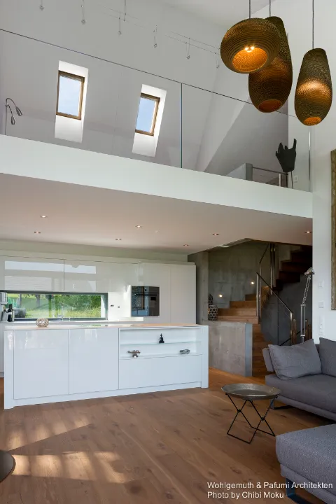
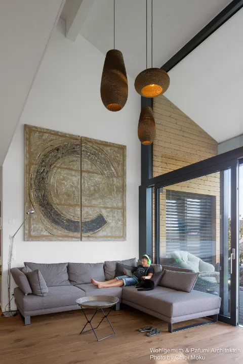
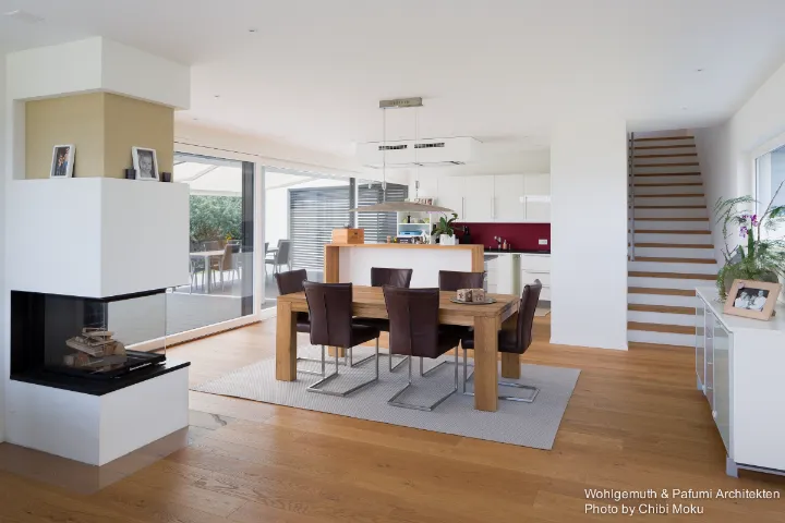
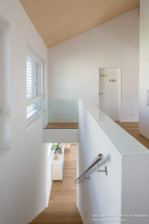
One of the most telling design choices is WPArch’s process of working “from the inside to the outside,” locking in relationships between rooms first, then shaping the exterior around how the family actually lives. The home is organized to support togetherness, anchored by an upper-level open plan where the living room, kitchen, and dining share one generous volume, but the proportions are intentionally controlled so the space still feels comfortable, not oversized. That “big room” becomes the daily core of the home, as the owner puts it: “The whole family comes together cooking and working and playing and talking.” Vertical movement plays a major role too, with a striking stair sequence and double-height openness that creates a gallery-like interior without feeling showy.
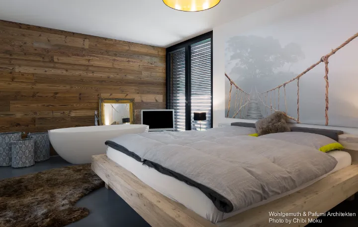
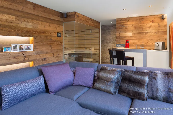
Throughout the house, the interplay between visible concrete and warm timber defines the atmosphere. WPArch describes the exposed concrete as a high-stakes element, “we have one chance to build it,” and the interiors show the payoff: the concrete provides precision and permanence, while wood surfaces soften the temperature of the space and keep it from feeling austere. A south-facing orientation brings sunlight deep into the main volume and connects to terraces and a pool area, extending the architecture outward in the most Swiss way possible, controlled, minimal, and highly intentional. In the end, the home succeeds not because it is complex, but because it is edited: a rectangular form, a disciplined material strategy, and a layout designed around family life rather than spectacle.