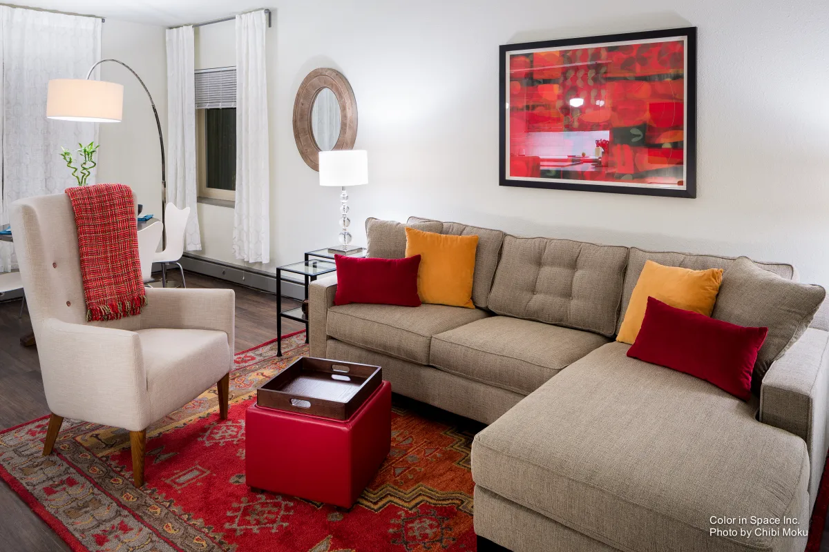
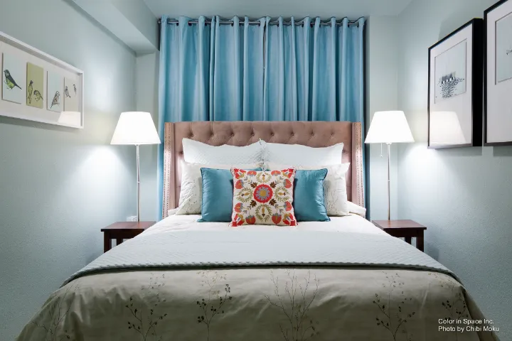
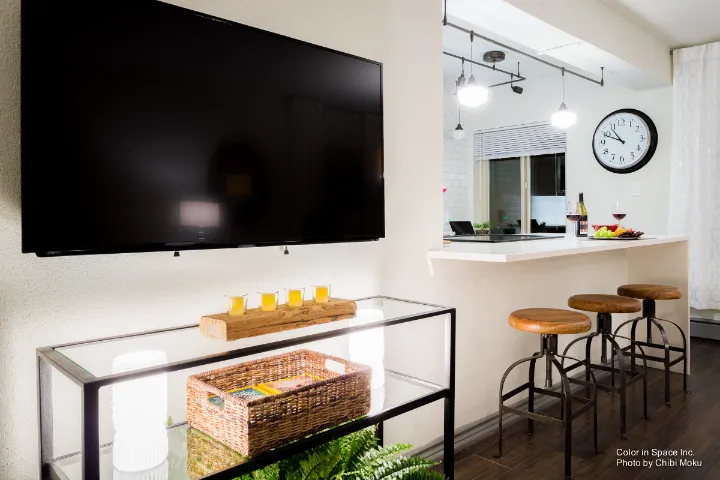
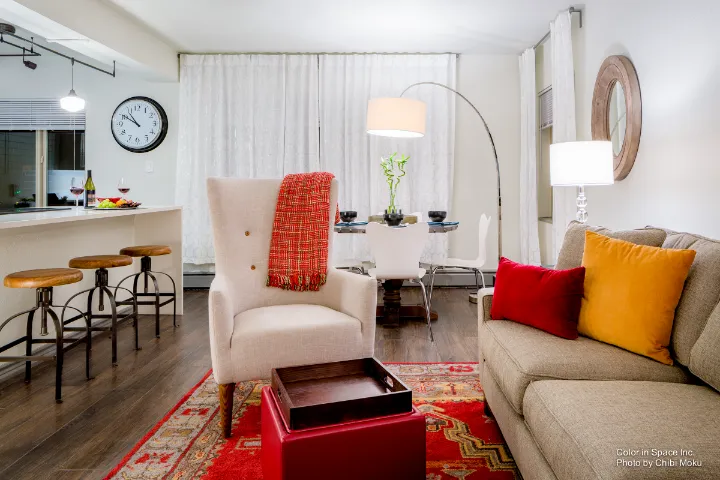
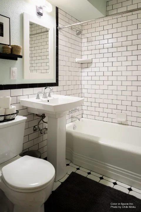
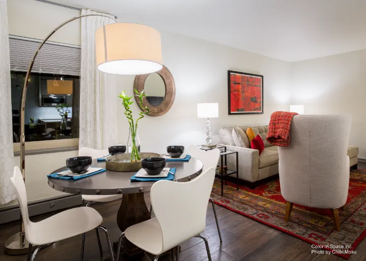
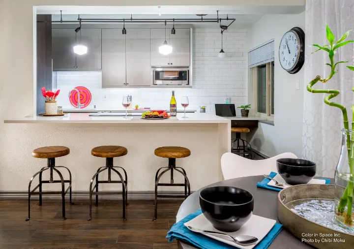
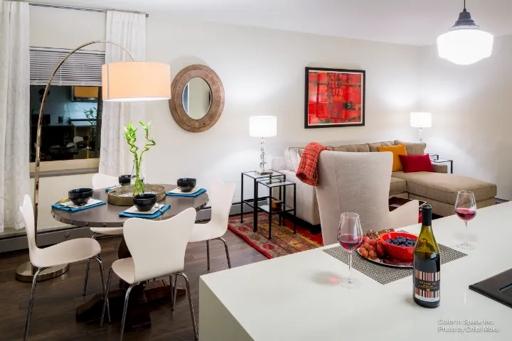
Color in Space approaches architectural color as a design system, not decoration, and The Dwelling Palettes™ are positioned as a practical tool for making that system usable for real homeowners. In this Seattle project, the setting is a compact downtown condo, which creates a very specific architectural challenge. The owner wanted the home to feel bright and open, but still comfortable and inviting: “because this is a downtown condo and it’s not very big… I knew I wanted it to feel really light… without being cold.” That goal is fundamentally architectural, because color here is treated as a spatial strategy, affecting perceived volume, temperature, and how light moves through the interior.
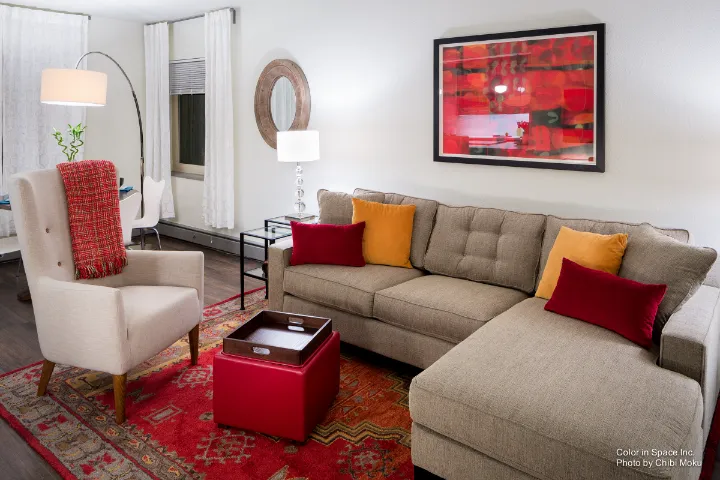
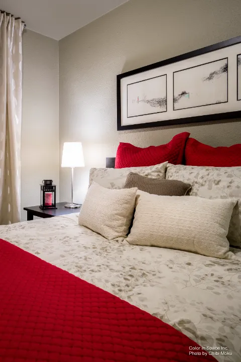
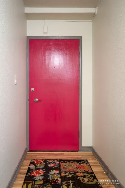
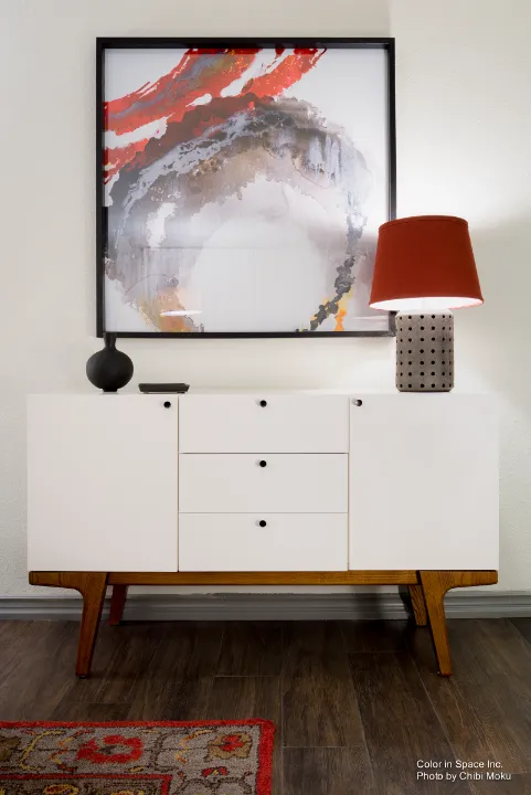
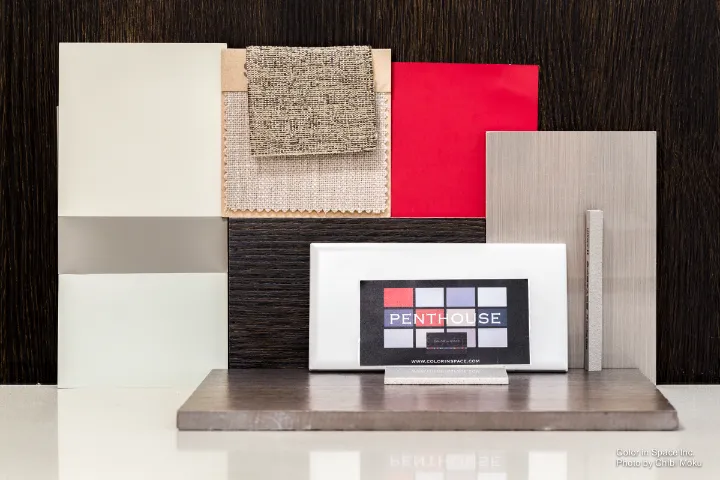
The Dwelling Palettes™ are designed as curated sets of Benjamin Moore colors meant to work together through complementary relationships and shifting light conditions. As described in the video, there are “eight different dwelling palettes” and each one includes “12 Benjamin Moore paint colors.” The condo’s personality suggested one clear direction: “to me, because this is downtown… it just spoke to me. It’s the penthouse palette.” That palette is presented as “a real cosmopolitan sort of clean look and feel,” built around “subtle, very light grays,” supported by controlled high-contrast accents like “dark gray, black,” and select reds.
What makes this project interesting is the restraint and editing process, which mirrors how architects and interior designers narrow down material palettes. Even though the palette provides twelve options, the condo used fewer to stay aligned with the space and its finishes: “while you get 12, I actually only used five of the paint colors… and I narrowed it down to these five because of the architectural finishes we chose.” Instead of treating the palette like a strict formula, the method is presented like a design toolkit, something that can be adapted while still maintaining coherence. It reinforces a core professional idea: consistency is not about using more choices, it’s about using fewer choices better.
In use, the palettes function as an on-site decision-making tool, almost like a portable finish schedule. The owner describes carrying it while shopping to prevent the common drift that happens when furnishings and decor are chosen independently: “I would always bring the palette with me no matter what store we went to,” because it instantly clarified whether an item belonged in the system or not. That directly addresses one of the most difficult parts of residential design, the sheer number of possible choices. The palette becomes a filter: “there are zillions of choices… and that’s where it gets overwhelming… the palettes really serve as your road map to narrow things down.”
Ultimately, this Architecture Spotlight is less about a single condo and more about how color can be treated as architecture, responding to light, context, and adjacent finishes instead of being selected in isolation. Color in Space frames this as a democratization of professional design logic, making the process visible and repeatable. As the speaker puts it, the Dwelling Palettes “enable everyone to have good color sense,” turning an abstract design skill into something tangible and testable in real time, with the palette itself acting as a simple, physical guide for maintaining an intentional architectural mood throughout the home.