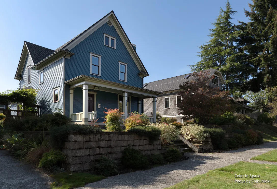
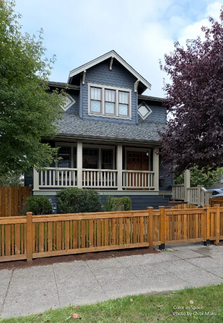
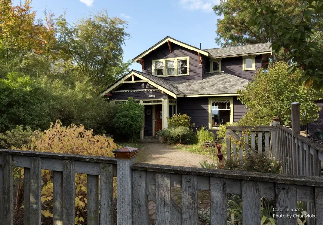
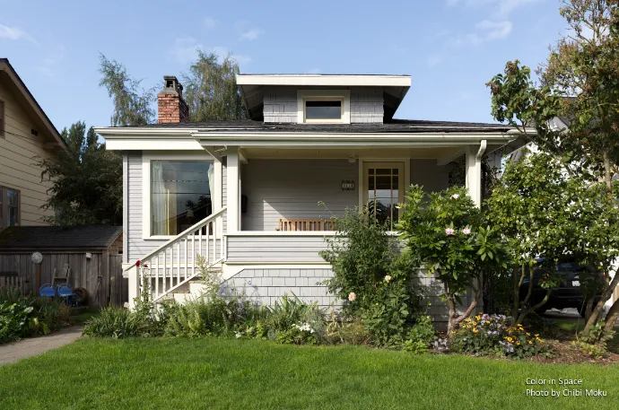
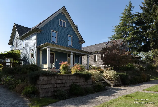
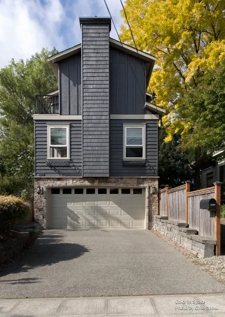
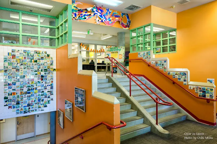
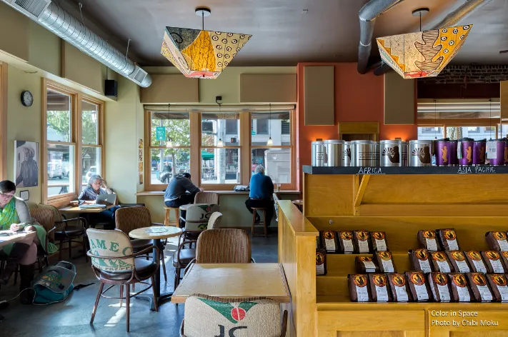
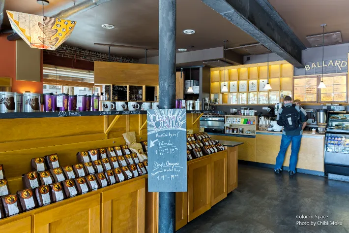
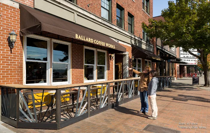
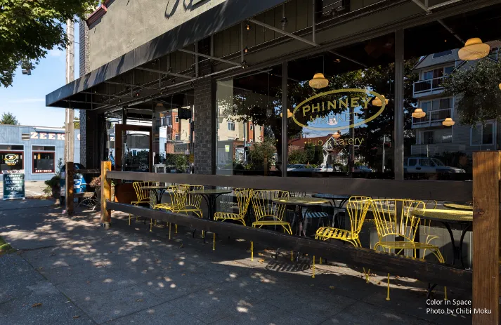
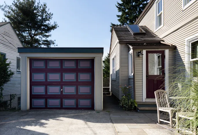
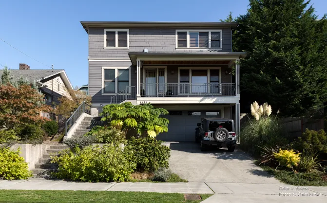
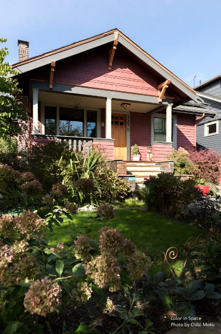
In this Spotlight, Color in Space frames architectural color as something active and relational, not a final decorative layer. Set in Seattle, the conversation begins with the city’s architectural character, rooted in the late 1800s and early 1900s Arts and Crafts era. The speaker points directly to the regional DNA: “Seattle was established when the arts and crafts period was at its height… in terms of the architecture and then the craftsmanship in mill work and the carpentry.” In this context, color is treated as a way to reveal form and detail, helping the workmanship read clearly and giving the architecture more presence rather than competing with it.
Color in Space’s design philosophy builds from nature as the baseline reference system. “When I think of color on the exterior, mother nature has the best color design principles I’ve ever encountered,” and the goal becomes translating those principles into the built environment. Instead of selecting colors based purely on trend or preference, the method focuses on harmony, balance, and how color behaves under real light. This is especially relevant in Seattle, where cloud cover and shifting daylight constantly alter exterior perception and where materials like woodwork and millwork create complex surfaces that respond differently throughout the day.
A core concept in the video is the idea of complementary colors as complete systems, not isolated choices. The speaker explains the color wheel like a design tool that predicts relationships: “complimentary colors… complete the spectrum,” and because of that, “they actually vibrate higher when they’re together… they enhance each other.” In architectural terms, this becomes a strategy for building visual energy without relying on loud saturation. The approach emphasizes pairing warm and cool tones to create a balanced environment, because complementary pairs naturally introduce that contrast: “one’s a warm color and one’s a cool color… that’s how I can increase the energy and the vibration and give off a better feeling environment.”
The execution of this work depends on accuracy and repeatability, which is why Color in Space relies on a consistent paint system. Benjamin Moore is called out as foundational to the process, not just a preference: “one of the reasons I use Benjamin Moore is because I know that what I see on that printed swatch is going to be identical to the paint formula.” That reliability is positioned as essential for professional color design, where small chromatic shifts can change the reading of an entire elevation, especially when multiple materials and light conditions interact.
Ultimately, this Spotlight presents Color in Space’s practice as a mix of design science and emotional intent. Color is described as living and responsive because it is light-based: “they reflect light… they have an energy and a life of their own.” The mission becomes creating environments that feel better, not merely look better, through intentional balance: “it’s not about beauty for beauty sake. It’s about beauty because of what it makes me feel inside my body.” In the context of architecture, that makes color a form of relationship design, between building and landscape, between material and daylight, and between the exterior shell and the people who experience it every day.